
Membuat menu navbar yang menarik salah satu hal yang penting untuk website, Menu atau bisa disebut Navbar memiliki link yang bisa diarahkan ke halaman utama ataupun halaman konten yang ada di dalam website. Desain menu navbar menjadi responsive sangatlah mudah untuk diterapkan. Lalu seperti apa cara membuatnya? pada artikel alafgani.web.id kali ini kita akan membahas bagaimana cara membuatnya.
Baca Juga : Membuat Modal Popup HTML Dengan JavaScript Beserta CSS
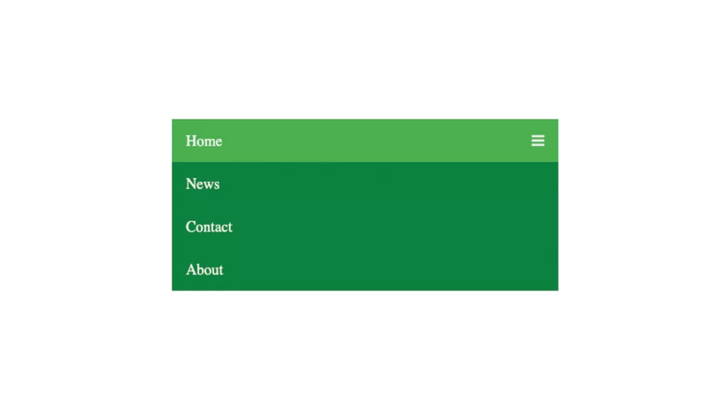
Untuk membuat navbar, Kita perlu menggunakan tag <nav>. Tag <nav> berfungsi untuk memberikan link navigasi. berikut ini adalah kode html nya:
<div class="topnav" id="myTopnav">
<a href="#home" class="active">Home</a>
<a href="#news">News</a>
<a href="#contact">Contact</a>
<a href="#about">About</a>
<a href="javascript:void(0);" class="icon" onclick="myFunction()">
<i class="fa fa-bars"></i>
</a>
</div>
Desain Menu dengan CSS
Untuk mempercantik tampilan navbar kita perlu memasukan kode css kedalam style.css.
/* Add a black background color to the top navigation */
.topnav {
background-color: green;
overflow: hidden;
}

/* Style the links inside the navigation bar */
.topnav a {
float: left;
display: block;
color: #f2f2f2;
text-align: center;
padding: 14px 16px;
text-decoration: none;
font-size: 17px;
}

/* Change the color of links on hover */
.topnav a:hover {
background-color: #ddd;
color: black;
}

/* Add an active class to highlight the current page */
.active {
background-color: #4CAF50;
color: white;
}

/* Hide the link that should open and close the topnav on small screens */
.topnav .icon {
display: none;
}
/* When the screen is less than 600 pixels wide, hide all links, except for the first one ("Home"). Show the link that contains should open and close the topnav (.icon) */
@media screen and (max-width: 600px) {
.topnav a:not(:first-child) {display: none;}
.topnav a.icon {
float: right;
display: block;
}
}

/* The "responsive" class is added to the topnav with JavaScript when the user clicks on the icon. This class makes the topnav look good on small screens (display the links vertically instead of horizontally) */
@media screen and (max-width: 600px) {
.topnav.responsive {position: relative;}
.topnav.responsive a.icon {
position: absolute;
right: 0;
top: 0;
}
.topnav.responsive a {
float: none;
display: block;
text-align: left;
}
}
Kode Tambahan JavaScript
Membuat menu navbar responsive kita memerlukan menu yang interaktif dengan javascript.
function myFunction() {
var x = document.getElementById("myTopnav");
if (x.className === "topnav") {
x.className += " responsive";
} else {
x.className = "topnav";
}
}
Penutup
Sekarang Anda sudah bisa membuat navbar atau menu responsive sehingga website Anda lebih menarik dan profesional. Silahkan tinggal Anda jalankan file html nya untuk melihat hasilnya. Berhasil kan? Semoga bermanfaat jangan lupa klik tombol sharenya ya.
Menyukai Kucing, Terkadang ngopi dikala Hujan, Menyukai Website.